
The best part of our job is that we get to meet amazing therapists, counselors, coaches and psychologists doing amazing work. We had the pleasure of working with Karen Midyet to launch her new coaching business, Coaching Aging Adults.
The Goal: Creating A National Coaching Brand
What was so exciting about Karen’s project to me was that she wasn’t just refreshing an old website, but creating an entirely new business!
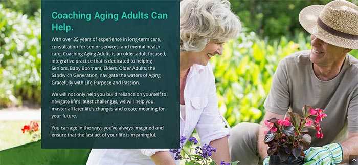
Karen had built a great private practice, Colorado Senior Counseling, serving her local population of adults facing the challenges of aging, working with caregivers and their transition to retirement.
She’s collected a wealth of information and resources helpful to the aging population as well as for caregivers who work with older adults.
It’s time for Karen to share those resources with the world!
Now, she has a vision for what she wants her business to look life for the future.
Karen decided she wanted to reach a larger population with resources and coaching services and be more selective about how she spent her time in her business as she gets older.
She also has a vision of starting a podcast and offering online training.
In order to do that, she launched a new business, Coaching Aging Adults, and has begun the work of building a new online platform for herself.
When Karen and I first spoke, we discussed the challenges she’d face in creating an online platform and how we could work together to meet those challenges head on.
Knowing The Target Audience: Intentional Website Design
The target audience for the Coaching Aging Adults website was very clear:
Aging adults, caregivers, retirees and upcoming retirees, as well as other businesses she can consult with about the challenges associated with aging.
This meant that the majority of people using this new website would adults over 50 years of age.
So we had to be sensitive to this population and make sure the design would help them as they navigate the website and not hinder them from being able to get the resources they seek.
A key piece of our research for this project was a resource guide from the National Institute on Aging containing research on the key factors of making a website senior friendly.
Here are some key points from the research that we took into account:
1: Use High-Contrasts to Make Text Easy to Read
We knew that a large part of Karen’s audience may be reading with impaired vision in their older age.
One thing we made sure to do was always use high-contrast color combinations (with backgrounds and text) to make sure text was easy to read.
2: A Larger Font Sizes
Like the previous point, we needed to ensure that text was easy to read.
Another way to do this was to use larger font sizes all around.
In the Divi settings, we set the body font size to 18 pixels. The average text size for a typical website is 16 pixels.
This would ensure text would be easy to read on the page.
We also used large font sizes for all the headers so that readers could easily understand they were moving into a new section of the page:
3: Allow Additional Space Around Clickable Targets
Another way we made the website easier for the older demographic of users was to make sure that all buttons and clickable areas had plenty of space.
This will make clicking on those objects much easier for those with aging eyes or those not as experienced on a mouse like younger generations are.

Notice the large font size and overall size of the buttons. This makes clicking so much easier!
4: Give Instructions Clearly
Most other websites I’ve worked on targeted much younger demographics.
A younger audience may be more used to button shapes or intuitively recognize links when they see them.
With the older demographic, we made sure to use clear instructions so that users would know what we were asking them to do and how to move to the next step.
It also meant using the phrase, “Click here to…” more often than on other websites:
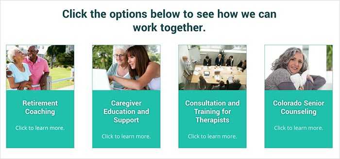
Building An Online Coaching Platform
In order to grow the reach of Coaching Aging Adults in the coming years, Karen needed a website that would be homebase for her business that would grow along with her business.
One of the best assets Karen has for her audience is her vast collection of resources.
She’s collected books, articles and helpful websites for each of the populations she servers:
- Caregivers
- Therapists who work with adult populations
- People transitioning to retirement
- Older adults with health challenges
And, as time goes on, Karen will be adding her own articles via her blog.
So one of the main challenges for this new website was to allow website visitors to see all these great resources and find them quickly.
The first step was to use WordPress’s built-in search capabilities to allow users to search information right from the main navigation:
Notice the search icon right in within the main menu. Clicking it brings up a search box:
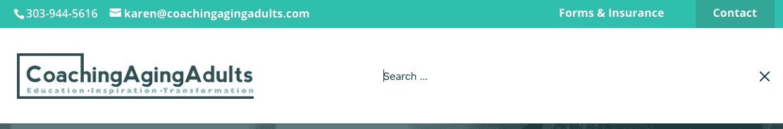
So at any time, visitors can easily find what they’re looking for.
Another way we made sure people could access the growing list of resources on the Coaching Aging Adults website was to create specific pages for each topic.
Not only would these pages be extremely valuable to Karen’s audience, but it would also help her grow some passive income through affiliate marketing of products that her visitors may find helpful.
Here’s an example of a page we created for resources for caregivers:
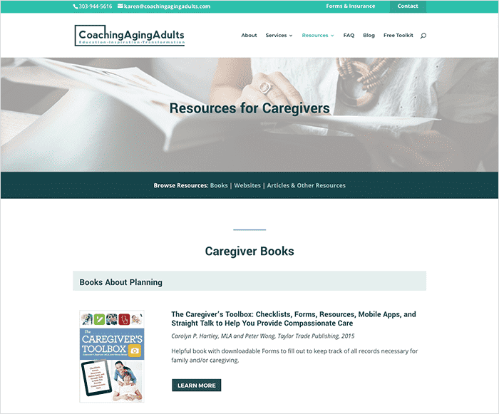
Because these resource pages will grow over time and be a bookmarkable page for those who take care of an aging family member or friend, we had to make them easy to navigate.
So, at the beginning of each section, we placed a navigation bar across the page, so an any time, the user could jump between the sections of the long scrolling page.
Another important challenge to these pages: they had to be easy to edit and add new content.
Luckily, the Divi WordPress Theme allows you to duplicate entire sections at the push of a button. So adding a new book in the future will be easy for Karen and her team.
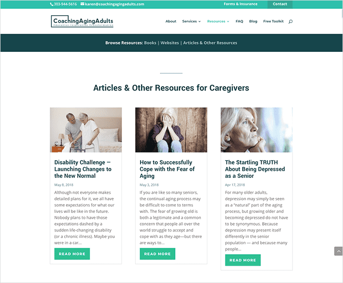
The last feature I’d like to highlight on these resource pages is how each one will feature Karen’s growing list of her own blog posts.
Using WordPress’ blogging categories, we’re able to display relevant posts on each resource page:
As the website grows in the number of articles, the more recent these pages will be and there will be more opportunities for website visitors to stay longer on the website.
What Karen Had To Say
I hope you enjoyed taking a little peek behind the scenes of the process behind coachingagingadults.com.
This project was a true collaboration and both Karen and I are excited about the results and looking forward to seeing how this new website serves her new business.
Here’s what Karen had to say about the process:
Grow your private practice with a new website strategy.
Get more traffic. Get more clients. Scale your practice.